Kate Nash CD Cover:
Made Of Bricks:
Front Cover:
 Artist:
 Kate Nash
Album: Made Of Bricks
Genre: Indie-Pop
Photography: Image of a dolls house with a picture of Kate Nash put onto it. Unrealistic, cartoon style. This makes it seem fun and surreal like a dream.
Colour Scheme: Bright Colours, yellow, green, blue, she stands out from the background with her red
dress on. The bright primary colours relate to the cartoon childlike style of the photography.
Fonts: The title is in a handwritten style font-fun, playful, not too serious. It is like a kid's handwriting
she is childlike. This makes the audience think that the songs will be fun and playful too.
Layout: The title of the album and the name of the band is at the top of the CD cover, the yellow dolls house is in the centre of the page, it is the centre focus of the photography. The house is surrounded by green trees that are cut into different shapes of animals. The photo of Kate Nash is in the middle of the bottom of the page. She is placed there as though she is going to walk into the dolls house. This makes her look like she is a doll, not taking things too seriously.
Mise En Scene: It is a simple image, there is a house, trees that are cut into shapes and an image of Kate
Nash.
Back:
Artist: Kate Nash
Album: Made Of Bricks
Genre: Indie-Pop
Photography: No photography is used on the back of the CD. It only shows what songs are featured on the album. The song titles aren't arranged neatly on the page, they are centralised to give it structure but they aren't in lines, this makes it more fun and personalised like Kate's personality. It looks as though she has written it herself which makes the audience feel closer to her and makes her seem more approachable through her album.
Fonts: She has used a handwritten style font to make it seem as though she has written it herself, it looks more girly and less formal. The song titles are in a bold handwritten font and the song numbers are in a normal handwritten font to make the song titles stand out against them and grab the audience's attention.
Layout: The song titles and numbers are centralised to give the back of the CD a structure to make it look professional. Down the sides of the page there is the name of the artist and the name of the album to show the audience what the album is, if it has been stacked on it's side. Underneath the song titles there is a barcode, this shows it can be sold. Under the barcode there is the small print explaining the producer and more information about the album.
Mis En Scene: It is a simple back cover, as it should be because it demonstrates her style and personality without being too overbearing and taking the focus away from the main function of the back of the CD (to tell the audience what is included in the album).
CD Artwork:
Artist: Kate Nash
Album: Made Of Bricks
Genre: Indie-Pop
Photography: There is no photography used on the CD of this album. It is simple and matches the back of the CD cover. They have used the same colour (navy blue) throughout to show continuity and show they all belong to the same CD.
Fonts: Around the sides of the CD in the small print they have used an easy to read formal font like "times New Roman". The font used in the centre of the CD is repeated from the front cover of the CD and the back cover. This becomes the recognised logo of Kate Nash, so that the audience can become used to seeing that font and know that it is her album. This font is handwritten and it looks fun and personalised. Once again, the name of the artist is larger than the title of the album to show which is more important. The audience is more likely to recognise the artist than just a title of an album.
Layout: The title of the album and the artists name is at the top of the CD in the centre as it will be the first thing the audience look at and what they will be the most interested in, as this confirms that it is the right CD. The small print around the edge is small because it gives extra information about the album that the audience don't usually read and this is why it is not as important as other text.
My Best Friend Is You:
 Artist:
 Kate Nash
Album: My Best Friend Is You
Genre: Indie-Pop
Photography: A photo of Kate Nash's face is cut up to make a collage along with some collaged pictures, and also Kate's arms are collaged onto the image to make up a new one. This makes it look like it is just thrown together. She hasn't tried too hard this suggests she isn't bothered about being perfect which the audience will relate to. Also the image is artistic in a way so the audience would be attracted to the colours and design, making it stand out from other CDs.
Colour Scheme: Bright, colourful, girly, red, blue and white, it could also represent Britain which is where she comes from. The main colour of this CD cover is the white from the background, this makes it seem light and girly. Her target audience is girls/ women so the bright colours would appeal to them.
Fonts: The font used for Kate's name is the same font as what she usually uses for her CD's, it is a handwritten font, it looks childlike which makes the audience think it is fun, and not to be taken too seriously.
The font used for the title of the album is a simple, plain font. This is so it is easier to read.
Layout: The collaged images are in the centre of the CD cover, Kate's name is written over the top of the collage, but it is shaped to fit the collage The name of the album is at the bottom of the CS cover just underneath the collaged image.
Post-Production: The photo of Kate Nash before it was cut up, was edited to make it darker and give it a blue tint. The other piece of her head was edited to make it dark and was given a grey scale effect. The image of Kate's head is cropped to fit around the shape she is making with her fingers. Then the rest of her head is shaped around that to make it seem as though she is still in the same shape. The whole image is abstract. It is artistic making it stand out to the audience from other CDs.
Mise En Scene: There is an image of a heart and then cut up pieces of a photo of Kate which is put back together in a collaged effect to make it look like a different picture. The heart could relate to the title of the album which is "My Best Friend Is You" -showing she has love for her friend.
My Best Friend Is You, Back Cover:
 Artist:
 Kate Nash
Album: My Best Friend Is You
Genre: Indie-Pop
Photography: There is no photography on the back of the CD, the only image is the bar code.
Colour Scheme: The background of the CD is the same colour as the CD cover, which links it together and shows they belong together. It is a kind of pink and white colour. It is light and girly and links to the album.
Fonts: The font used on the text on the back is the same at the font used on the album name on the cover of the CD, it is simple and clear, but also has an edge to it to make it more pop style.
Layout: On either side of the CD, there is the edge of the cover, where it shows the name of the artist and the name of the album. At the top of the page there is a bar code. Across the bottom there is credits and links to the producing company. At the side of that is the logo for IG press company which shows who they are working with.
Post-Production: The colour of the background had to match the front of the CD cover so they could have used the colour match tool on Photoshop. Then the text was added which tells the audience what they will hear on the album.
CD Artwork:
 Artist:
 Kate Nash
Album: My Best Friend Is You
Genre: Indie-Pop
Photography: A collage of different pictures of Kate and of colours, linked with the CD cover (red, blue and white) It looks simple and fun like she has made a collage of her favourite things.
Colour Scheme: red, blue and white like on the CD cover, it could also be symbolising Britain as that is where she is from.
Fonts: The font used on the name of the artist is the same one as what she has used on the CD cover, it is a recognisable font for her name. It is simple like it has been handwritten. This gives it a more personal touch. The fonts used for the rest of the text is the same as the font used for the title of the album on the CD cover, it is plain but also has an edge to it making it look professional but showing Kate's personality.
Layout: There is a collage of different pictures arranged randomly about the CD, the title of the album is across the bottom of the CD.
Post-Production: After taking the photos of the different images on the CD they have been edited on a computer. The pictures of Kate have been tinted red and others have been given a grey scale effect. This accounts for most of the different colours used on the CD. It has a vintage look about it, this relates to the style of person Kate is.
Artist of Same Genre: Eliza Doolittle
Eliza Doolittle:
 Artist:
 Eliza Doolittle
Album: Eliza Doolittle (self-titled)
Genre: Indie-Pop
Photography: A photo of Eliza Doolittle, that has been put onto images of different famous buildings around the world and also pictures of different animals. It looks as though everything is balancing on an island that is surrounded by water, it is symbolic that she feels like she is on top of the world. Eliza's pose suggests she is having fun as she looks as though she is going to throw the dice in her hand at someone and she has a smile on her face, the photo is obviously posed but it looks naturalistic because she isn't looking at the camera.
Colour Scheme: Very light colours, girly, feminine, fun and bright. (Silver, pink, purple, blue, white and green) She has used this colour scheme because she is describing the sort of person she is as she has named her album after herself as it is her first album and this is how she is introducing herself to the audience. These colours suggest Eliza is fun, girly and bright.
Fonts: The font used on this CD cover, is a funky, block font, that is black which contrasts with the rest of the album cover and makes it stand out. This type of font is fun because the letters are not all the same size which shows the album is not trying to look plain.
Layout: The layout of the CD cover has the title of the album which also happens to be the name of the artist at the top of the album, which shows it is a vital piece of information."Eliza Doolittle" is not just written at the top of the CD, it has been put inside a long flag which is trailing from an aeroplane- like an sky written advertisement. In the centre of the cover there is the main image of lots of different buildings and animals balancing on an island, with Eliza on top of it all. In the background there is sea and sky, lots of clouds are at the top where her name is as it is supposed to be written in the sky and then at the bottom the sea is supposed to be surrounding the island.
Post-Production: After the photo of Eliza was taken, they have edited it onto the rest of the image on the computer. They have shaped her around the other pictures to make it look like she is actually sat on top of them and holding onto them. The different buildings from around the world are angled to make them look like they are trying to stay on this island, and they are also edited in colour, they are tinted to match the colour scheme of the cover. The whole image is made brighter so that it will stand out against other albums, and also it will match the artists personality.
CD Back Cover:
 Artist:
 Eliza Doolittle
Album: Eliza Doolittle
Genre: Indie-Pop
Photography: A photo taken of Eliza, it is a posed image as she is looking directly at the camera and is in an unnatural pose. The pose is fun and looks as though she is hiding herself by putting her arms in front of her but, the expression on her face has a cheeky smile as she is looking through her crossed arms.
Colour Scheme: bright, fun, pop style colours that match the CD cover to show they belong together, and it is a continuous cover. (pink, purple, blue and white) Then the use of black for the text, which matches the text on the CD cover.
Fonts: The fonts used on this back cover are the same as the one used on the CD cover, but they are arranged and made thicker or smaller to make them look different, the text is arranged to look like they are buildings and skyline advertisements which matches the CD cover. The rest of the information text at the bottom is written in a simple easy to read font.
Layout: The photo of Eliza is placed in the centre of the cover, her image fills the page vertically, surrounding her is the titles of the songs on her album, they are arranged to look like they are coming from her at different angles, they also have a style about them that makes them look like buildings or signs, this matches the CD cover. The background is just sky which links to the album cover, there is a few clouds but they are not as clear as in the CD cover.
Post-Production: The image of Eliza Doolittle has not been changed, but the surrounding background has been made brighter, the photo of Eliza was added to the background and the text around her was fitted around her at different angles.
CD Artwork:
 Artist:
 Eliza Doolittle
Album: Eliza Doolittle
Genre: Indie-Pop
Photography: There is no photography used on the CD.
Colour Scheme: Pink and silver, girly, feminine, pop style. Links to the disc Covers.
Fonts: The font used is the same font as what he's been used on the CD covers, it is fun, bold and funky. It is also pink which is part of the colour scheme.
Layout: The title of the album is in the middle of the disc but it also fills up the entire CD space. Eliza's second name could not fit across the diameter of the CD so they have run onto the next line making it look like it has been in a box. Surrounding the text, the background is a silver colour which matches the disc covers.
Post-Production: After the text was added to the disc with the silver background. They have added small print text that runs around the outline of the CD, this is extra information about the music company Eliza works for and is information that the audience doesn't need to read.


 Guy in Foundations, wearing skinny jeans and plain jumper.
 Kate Nash in Mouthwash wearing vintage flowery girly dress.
 Performers
 Performers
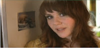
 Kate Singing


